Booming Computing Era Fonts
In the 1970s, tech giants were still discovering their identity, and a font to go with it.
Introduction
I’m no graphic designer, but I always keep an eye for interesting fonts, because to me, typography, since the printing press, has been an integral part of any printed media.
And since I’m into early computers, let’s talk about a few of them!
The typeface cards were made by me in LibreOffice Draw and they’re not great.
Intel
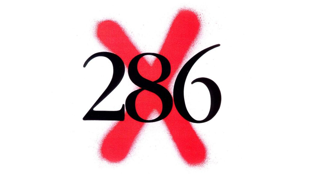
Before crafting their own font, Intel was an avid fan of ITC Garamond Std Book Condensed for display purposes, such as in this i386 ad, marking the 286 as old and obsolete:
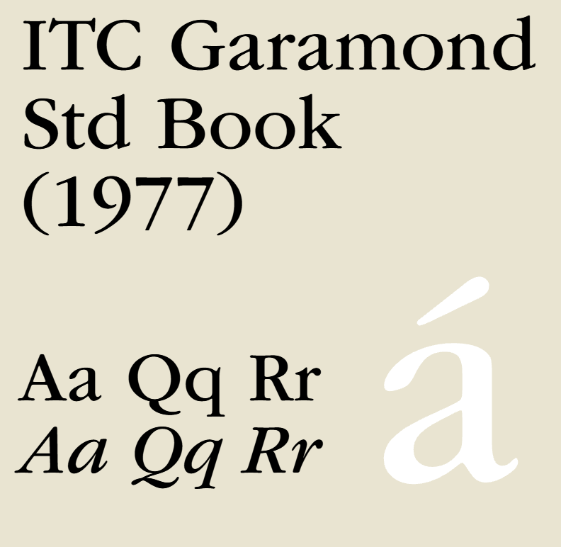
ITC Garamond is an interesting family featuring an interesting little spin while keeping it classy. Garamond is a style of old-style serif font that dates as far as the 16th century and is regarded as an ultimate classic when it comes to fonts.
It was designed by Tony Stan, and published by ITC in 1977.
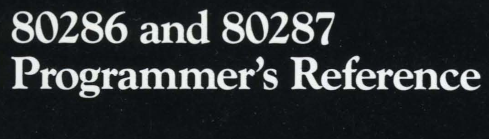
If you look close enough, you’ll see it in use in the 80286 and 80287 Programmer’s Reference Manual for display and text purposes!
So, what happened after the i386?
Nothing! They kept using it. As seen on their i486 Hardware Reference Manual:
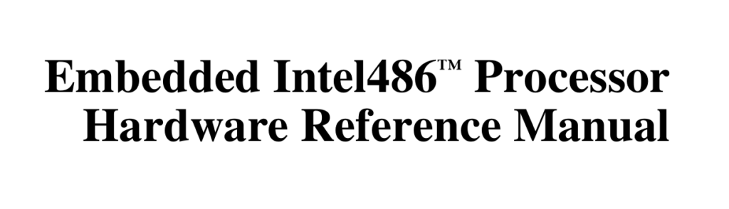
Surprise! This is actually Times New Roman. My guess is that it’s licensed cheaper or was already readily available (on Windows, perhaps?). Unless my PDF reader is lying to me about the font collection used in the manual.
By Pentium, the text body started being sans-serif.
Then back again to serif in the Pentium III Xeon manual…
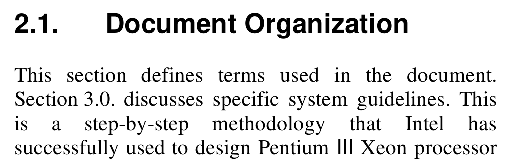
Intel and inconsistencies go great together!
Intel eventually made Intel Neo with the logo refresh in 2006, Intel Clear in 2014, and Intel One in 2020 for the newest logo refresh.
Now, for a company with a bit more consistency…
AMD
After cloning many Intel chips, AMD was finally done and ready to make their first design of their own.
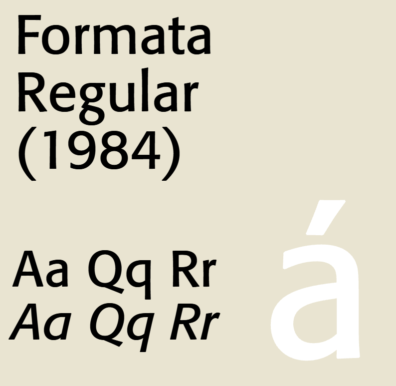
Since AMD is a little more forward in their branding, using Formata, as seen in their K5 Processor Technical Reference Manual, was an interesting choice back in the mid-90s.
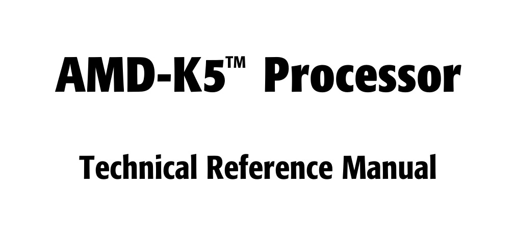
Formata is a sans-serif font designed by Bernd Möllenstädt, published by Berthold in 1984. It featured a semi-futuristic style that suited AMD somewhat well.
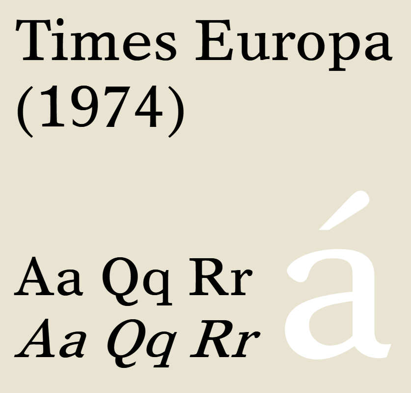
While titling used Formata, the text body used Times Europa Office.
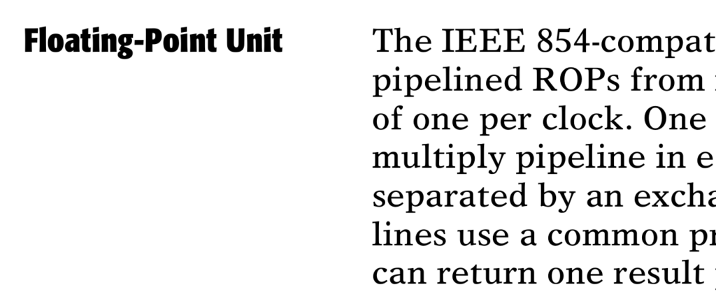
Designed by Walter Tracy, and published by Linotype Design Studio in 1974, Times Europa Office is a nice alternative to the Garamond old-style typeface.
Early AMD manuals were rather pretty compared to their competitor!
Later AMD manuals use some form of Arial and Times New Roman… What is up with these fonts? They’re everywhere! Can we go back to Formata and Times Europa, please?
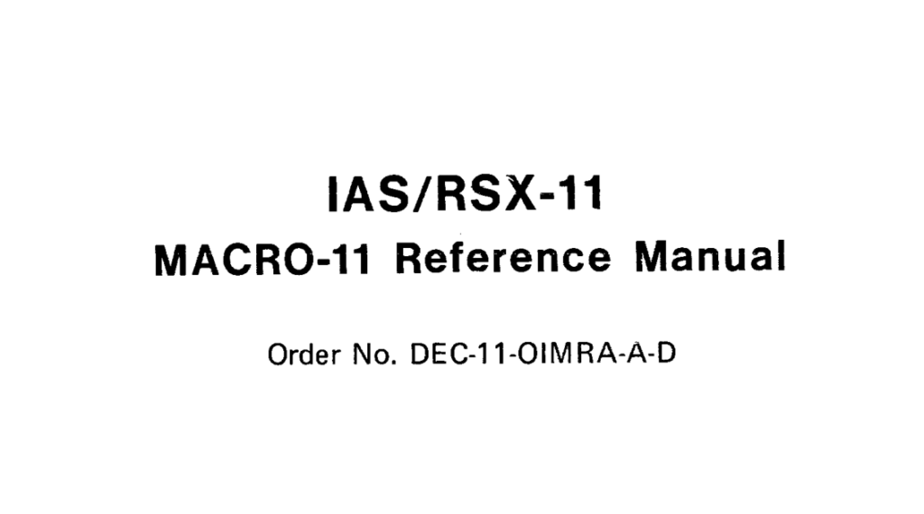
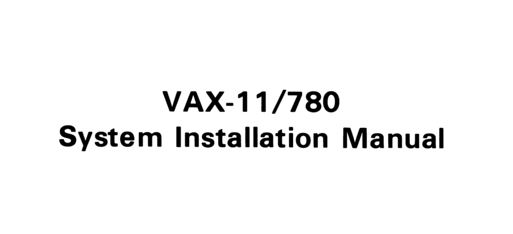
DEC
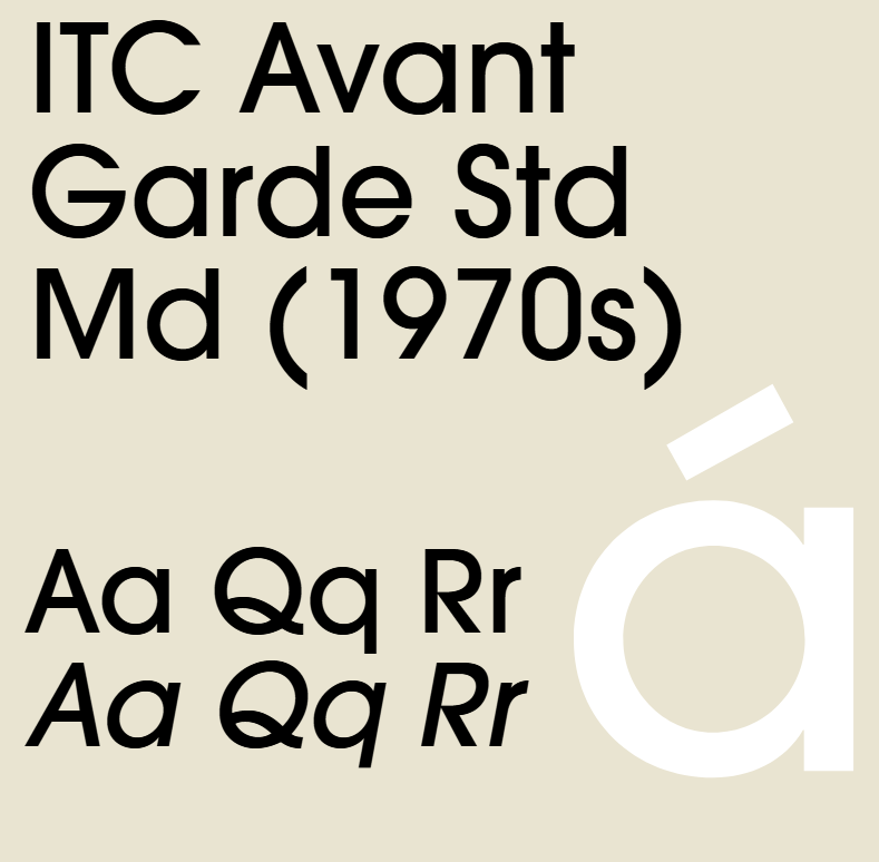
Ah, Digital Equipment Company, making such avant-gardist machines!
And so is their choice of font, ITC Avant Garde Gothic as their choice for a display font.

credits: me
The ITC Avant Garde Gothic typeface family were initially designed by Herb Lubalin and Tom Carnase, and published in the early 1970s. (Sorry, I only have ITC Avant Garde Std! It has slight variations)
For titling their manuals, Helvetica also used at times.
Inspiration source for the infamous AT&T assembler syntax, by the way
But it’s a font released in the early 2010s.
Regardless, DEC always had a preference for clean, perfectionist, sans-serif fonts.
Unfortunately, DEC is no more…
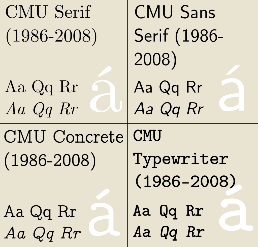
TeX
Computer Modern is the original typeface family used by the TeX program.
It was designed by Donald Knuth and released in 1986, then updated in 1992.
The modern, extended variant mostly in use for LaTeX is CMU (standing for Computer Modern Unicode), where version 0.1 released on April 10, 2003 and the latest stable release, 0.6.3a, on March 14, 2008.
CMU features Serif, Sans-Serif, Concrete, and Typewriter as their main settings.
LaTeX and derivatives continue to dominate the academic world.
Although, a lot of research papers tend to change the typeface of the document to something a little more modern than CMU. This choice often goes to Libertine.
Microsoft
Hey kid, remember Xenix?
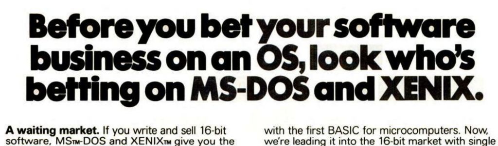
Once again, this is Avant Garde Std Md with some very serious, heavy bold.
Wrapping Up
Well, I think that does it. There were times when we cared a little more about typefaces.
Like, why does AMD use Klavika on their website, which is already pretty nice, but not in the reference manuals?
Funny enough, the Intel reference manual still uses Intel’s Neo font. Is Intel One unreadable in manuals, or do you fear the PDF font extractors?
Am I the only one who cares about this sort of stuff?!
Any who, until next time!